L'ARBRE À CAFÉ
strategy:
Founded by Hippolyte Courty in 2009 and highly praised by top chefs and artisans, L’Arbre à Café has established itself as the benchmark for highly sustainable specialty coffee.
A mission-driven company, certified B Corp, both producer and roaster, L’Arbre à Café’s mission is to transform the way coffee is produced and consumed, a staple of everyday life, by offering coffee that is highly flavorful, sustainable, and rooted in human values.
To embody this vision and high standards, and in anticipation of the new store concept, MV Design created the brand’s new visual identity and graphic territory.
solution:
The new identity reflects L’Arbre à Café’s ambition: to reveal the spiritual essence of coffee.
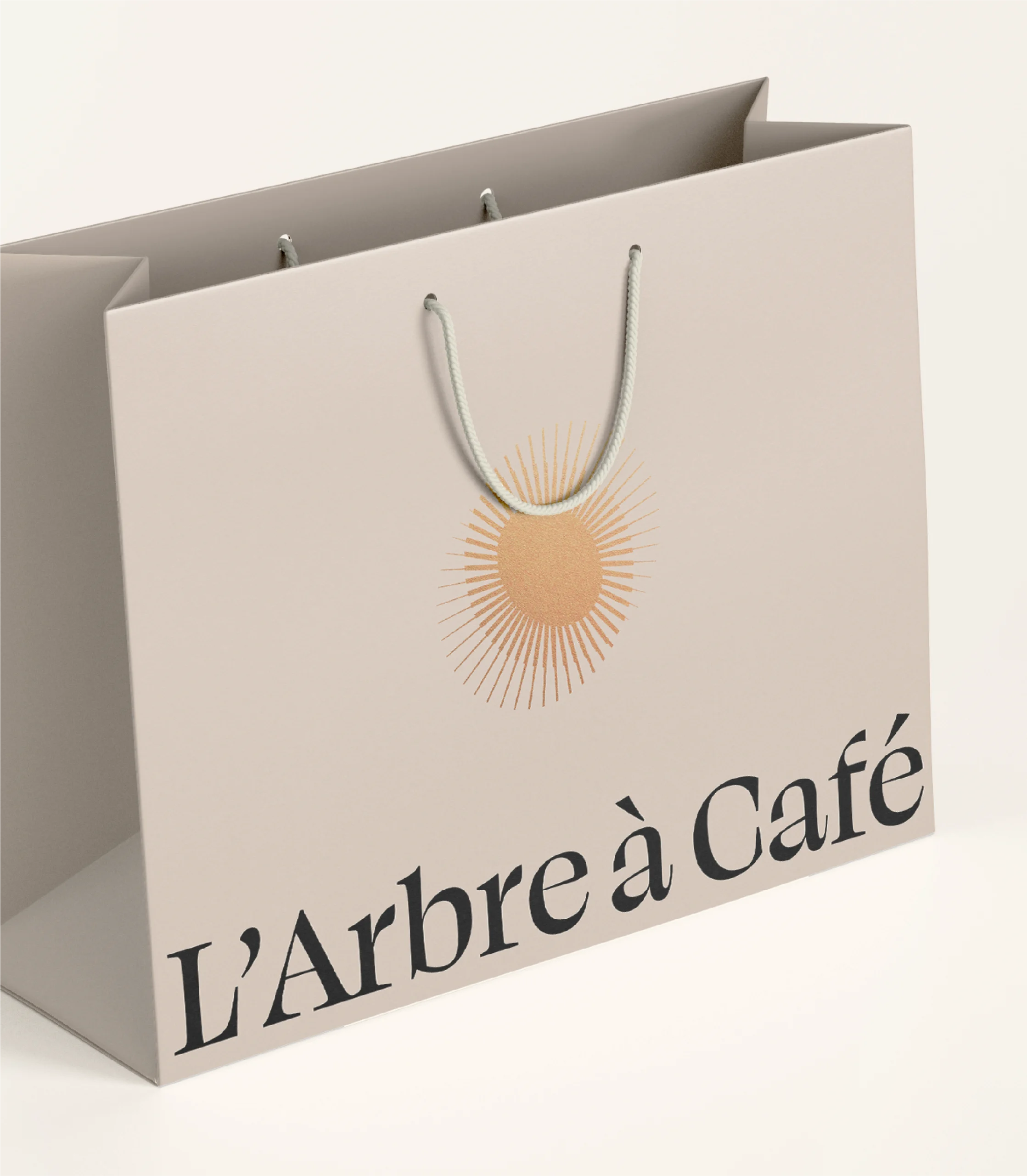
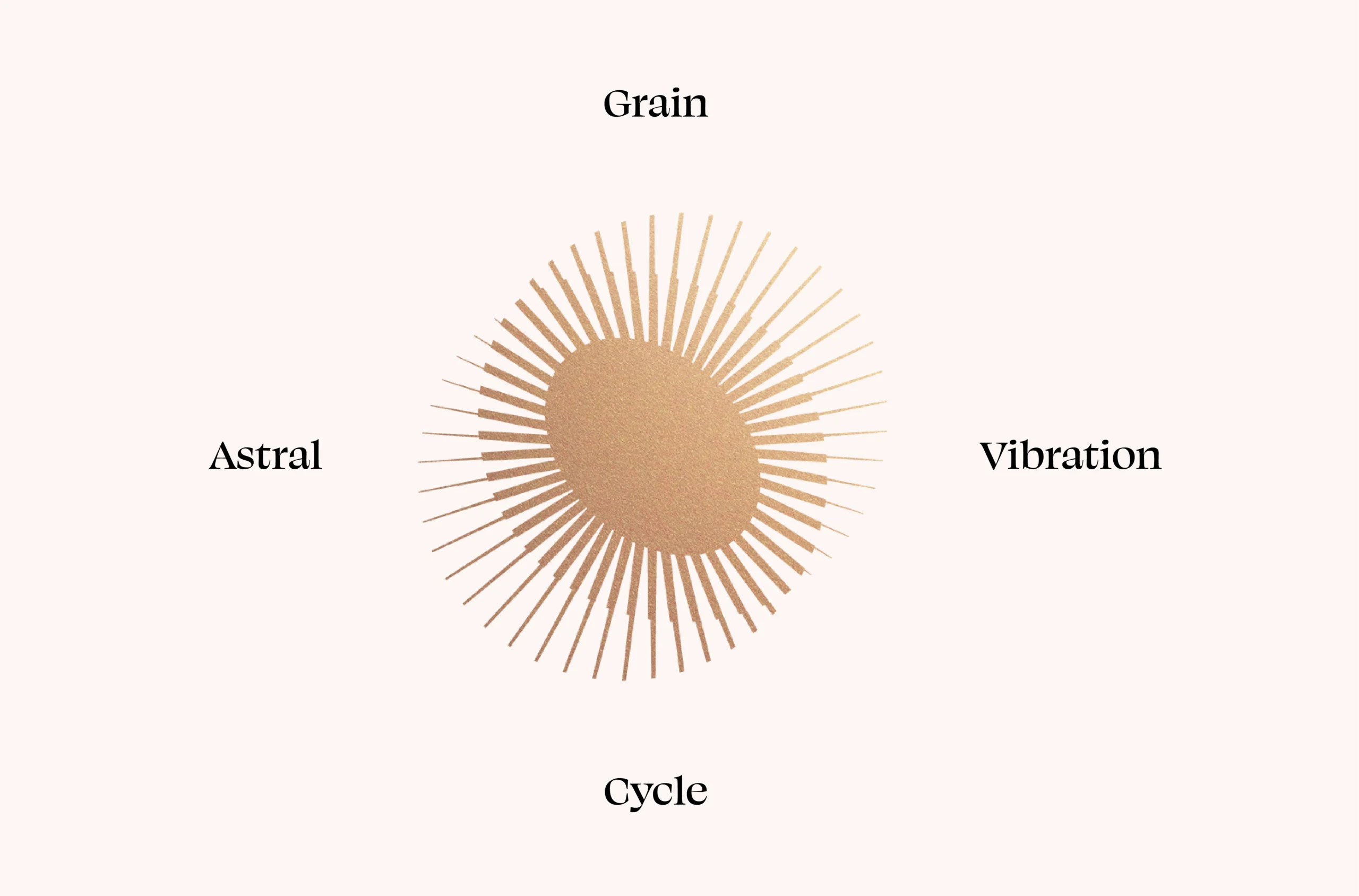
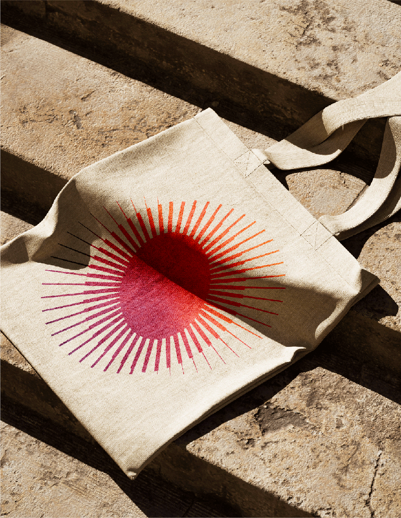
- The symbol is a double ellipse evoking the astral dimension of biodynamics and the cycle of nature. It creates a vibration around the core, which is a coffee bean..
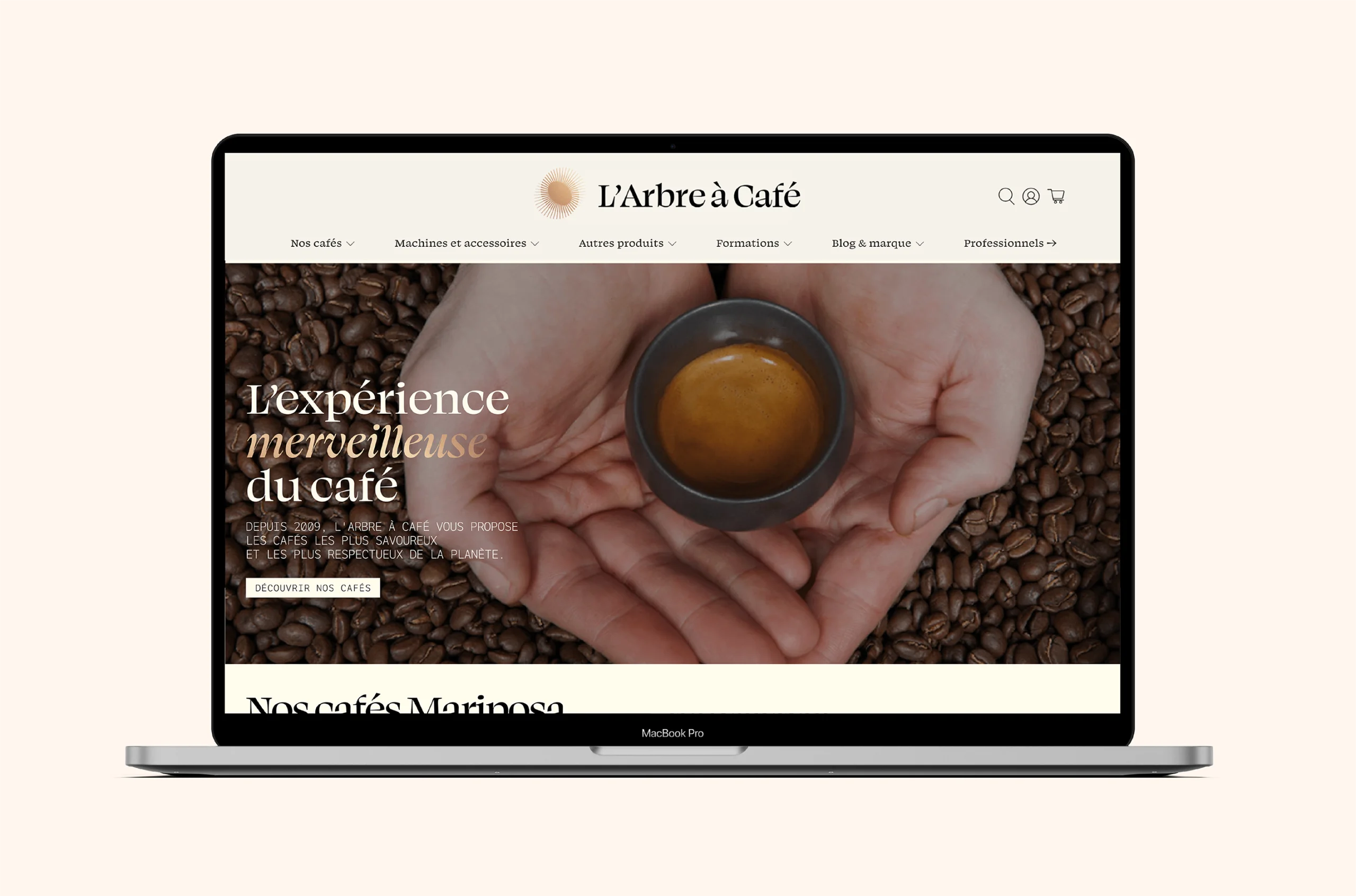
- The color, a coppery gold, enhances the precious and premium effect of the logo..
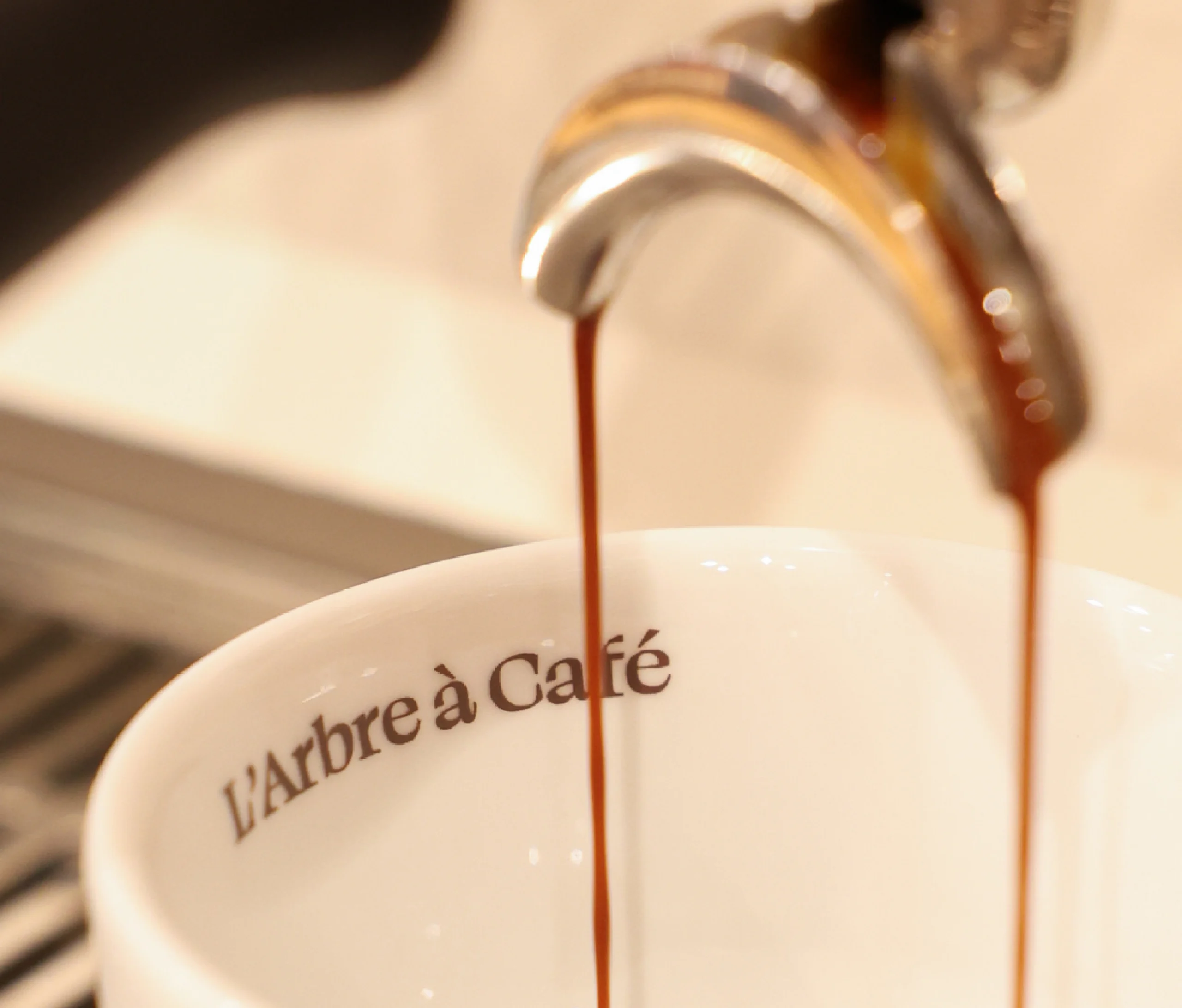
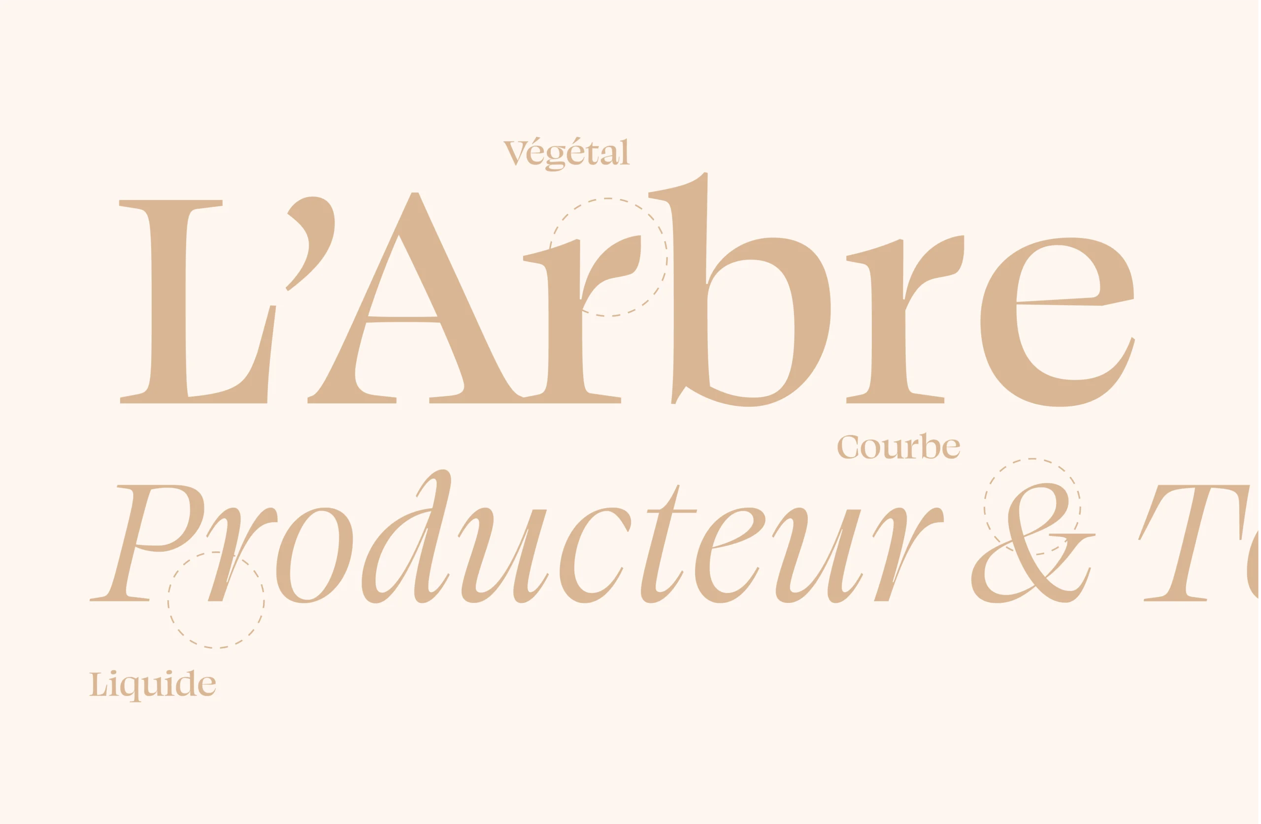
- The chosen serif typography is both elegant and grounded, with delicate curves that give it a fluid and organic feel. The typography is a rich agricultural brown, dense and deep, almost black. It embodies the energy of nature and the balance of elemental forces found in coffee..
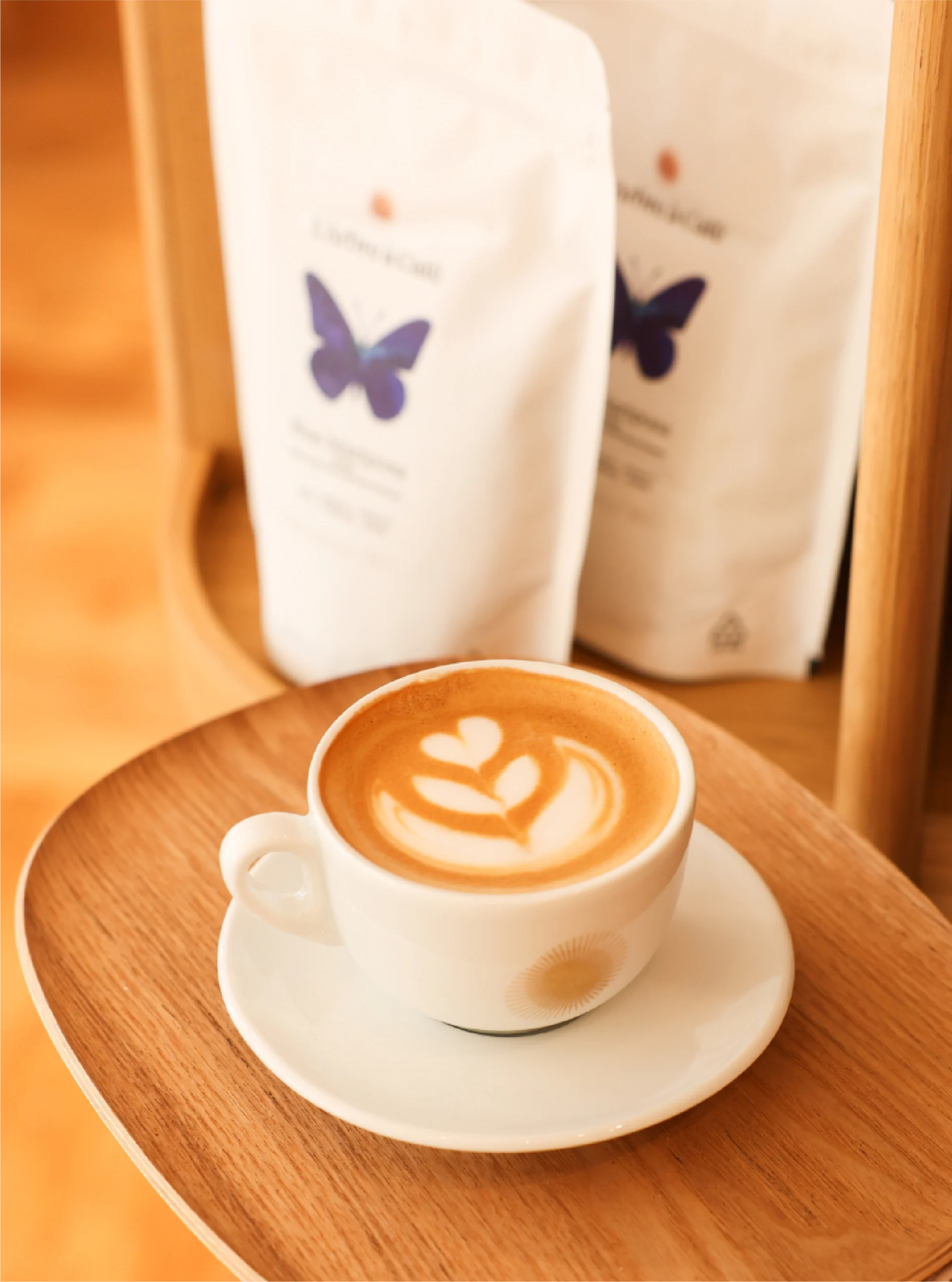
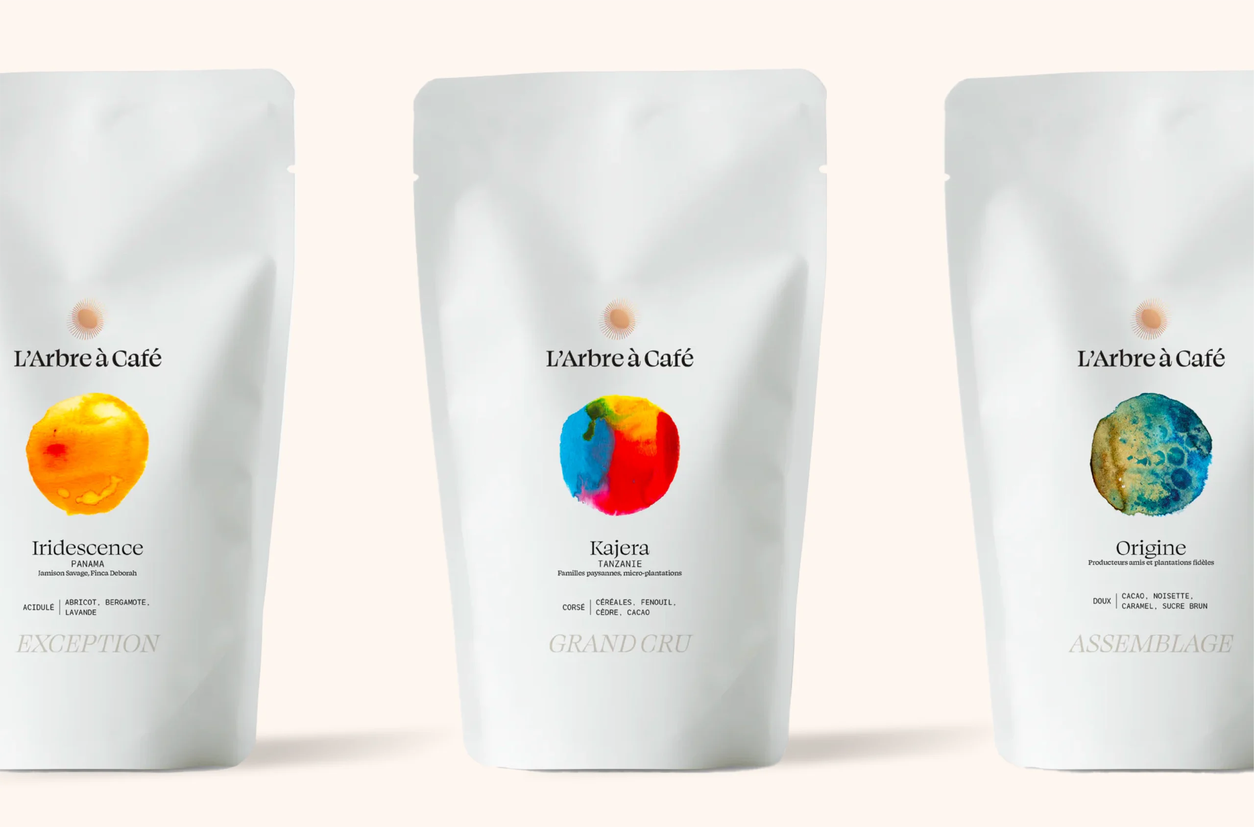
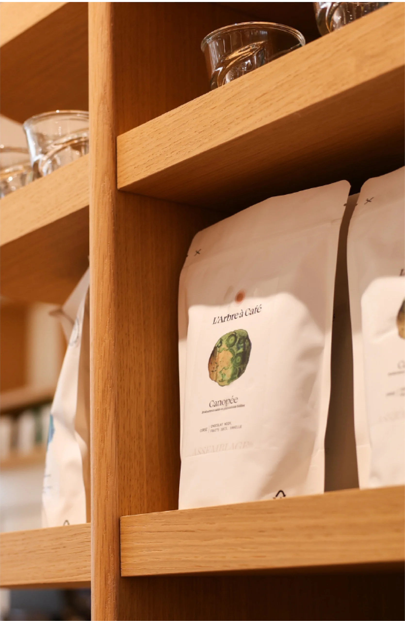
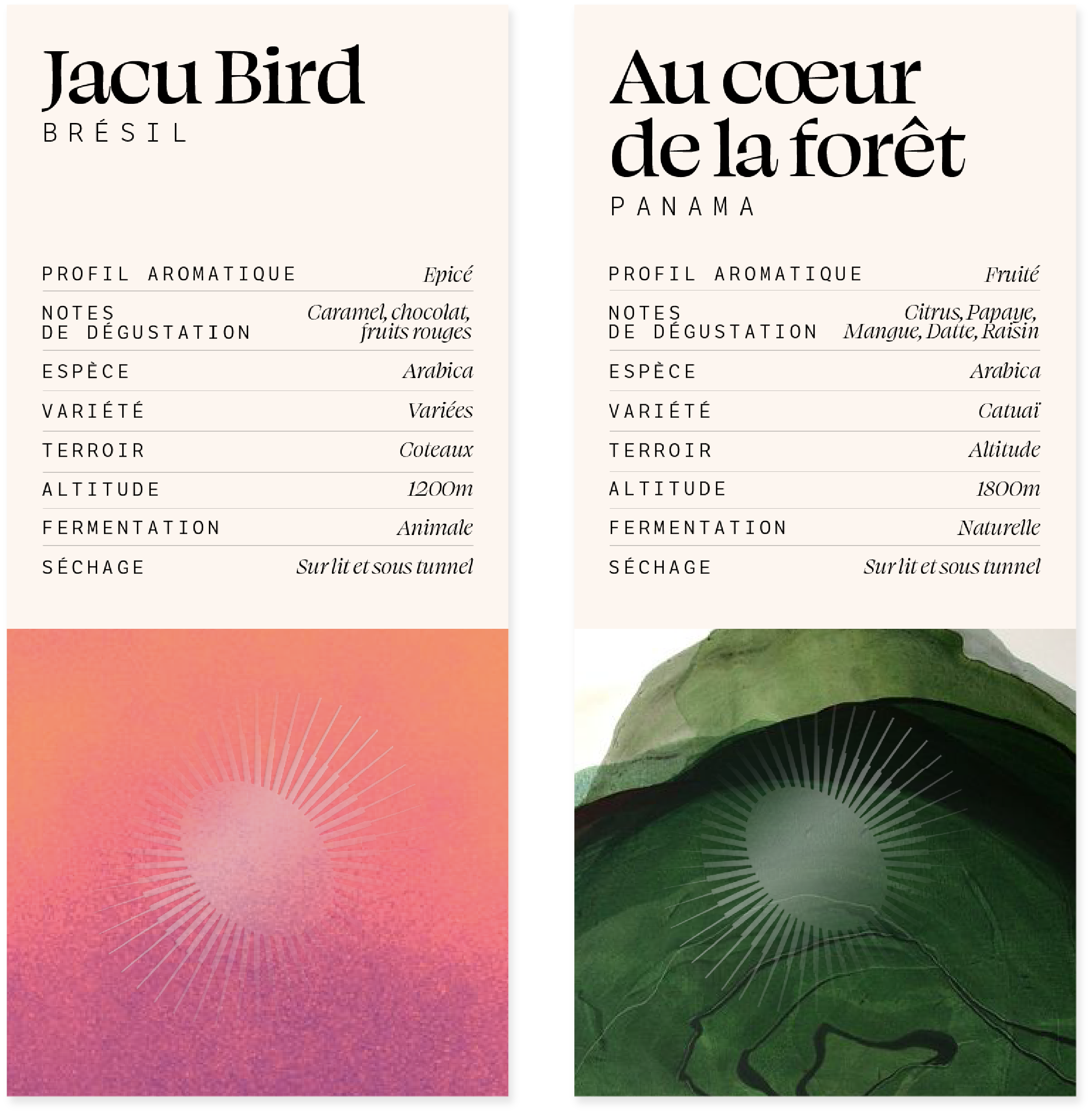
- Accompanying the symbol and typography, the dominant colors are brown, copper gold, and off-white, which highlight the colorful gradients carried by the various products.
expertise:
Strategy, branding, graphic territory, architectural concept.
